Destiny UI

Destiny is a multiplayer first-person-shooter video game, developed by Bungie (the guys behind the Halo franchise), and the UI featured in the game has been gaining a bit of praise online lately.
The two main things that make the UI unique is the use of a free moving cursor and the design aesthetic.
Free moving cursor
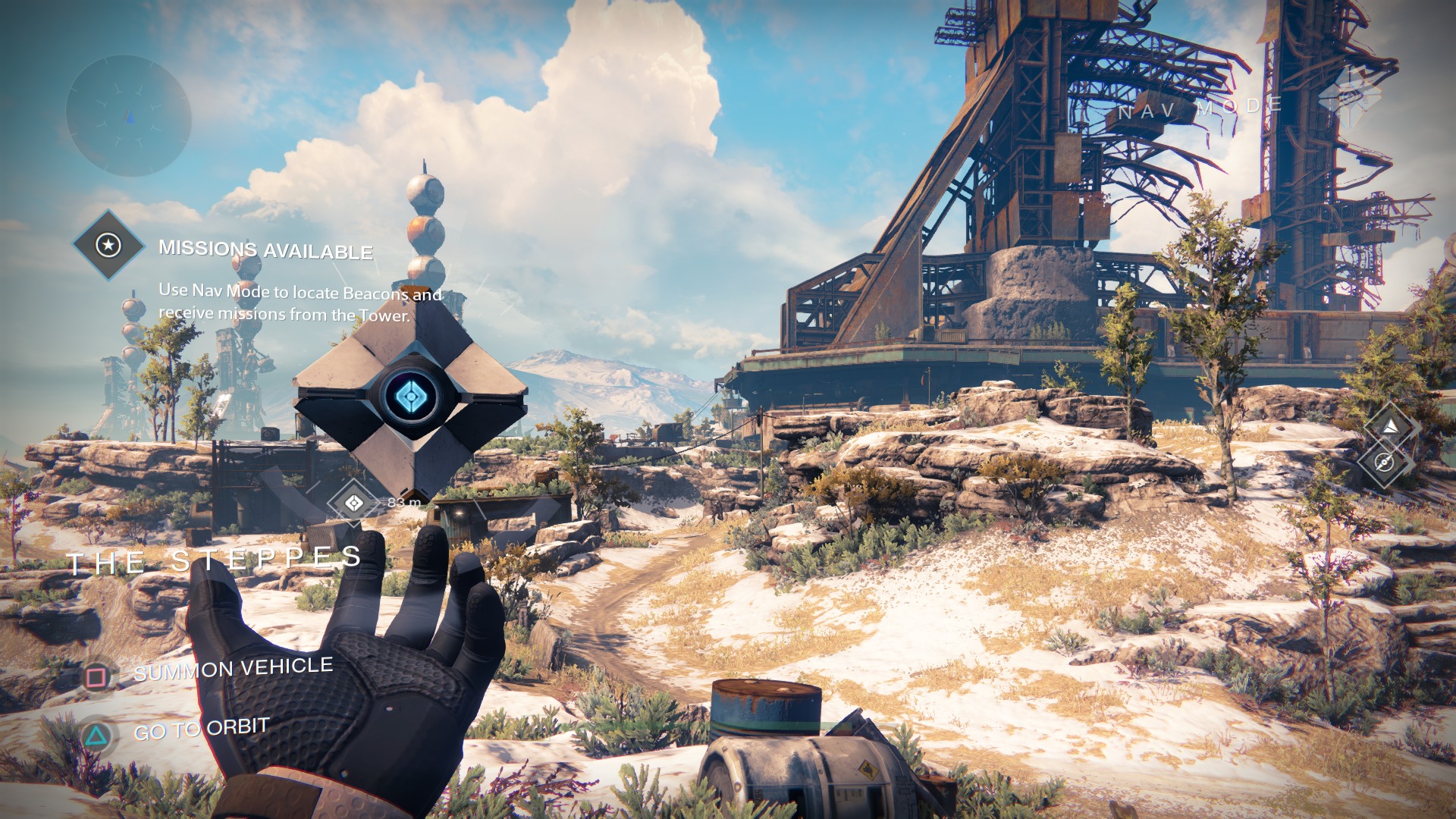
For a long time, console games have favoured menus that require the user to navigate through options step by step, using the analogue stick or directional pad (D-pad). Destiny, however, introduces a cursor that the user can move freely around the screen.
This gives designers more freedom in the layout of the UI. Interactive elements can now be positioned anywhere on the screen and the user will still understand how to access those items. Previously, you would have to either keep the interactive elements in close vicinity to each other or make sure there's visual cues to relate to the user how to step through to items that are positioned far apart.
This approach is also very helpful in games like Destiny that have very comprehensive menus. Using the stepped method would just be tiresome, it would require too many steps before arriving at what you want, or even worst, finding out that's not what you wanted. The stepped method just isn't great for deep menus, it doesn't make sense to have to step through multiple tiered menus just to explore what options are available. However, it is completely fine for shallow menus.
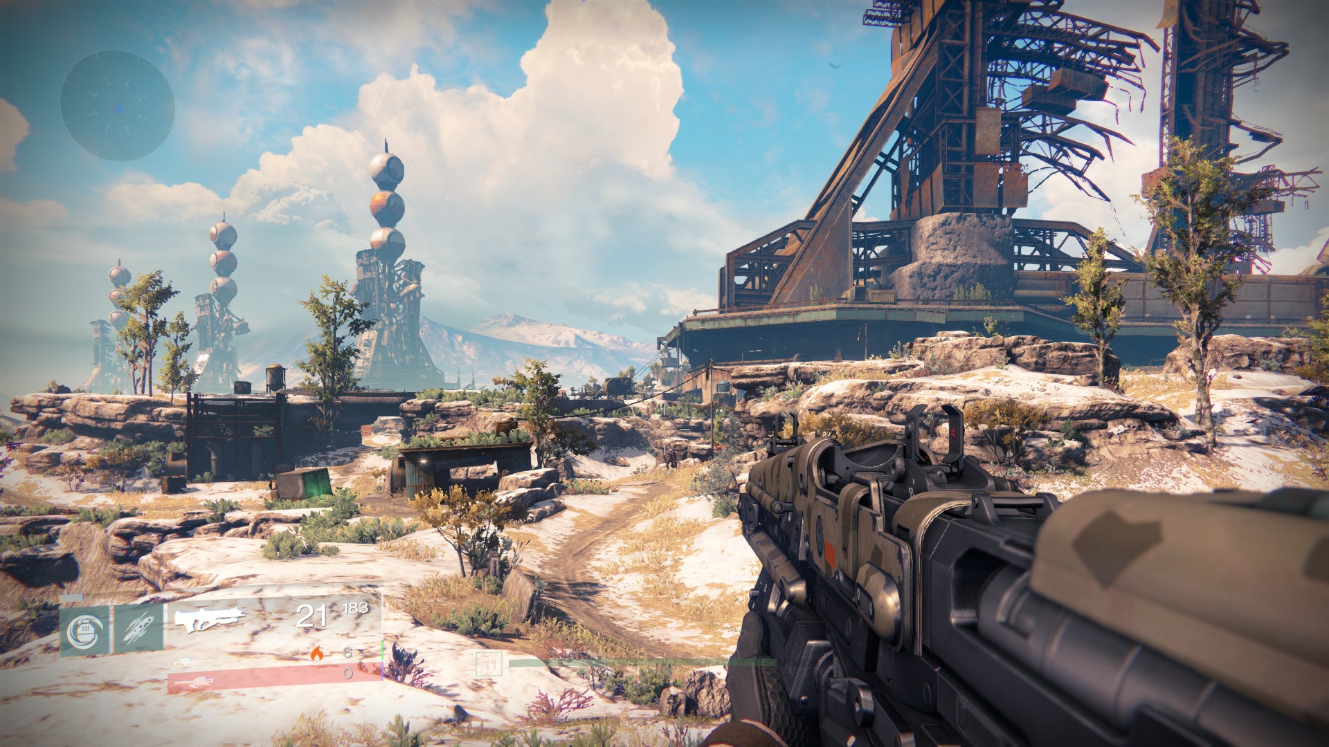
The Destiny UI also makes use of tooltips that appear as you rollover items. Because Destiny is so dense in content, this is a very elegant way of hiding content and allowing the user to control what information they want to display. This avoids having to fit everything onto the screen at once and tooltips of course work perfectly with a free moving cursor.
So the idea of using a free moving cursor in Destiny is a good one, it's an elegant solution to it's unique requirements.
Flat design
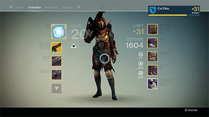
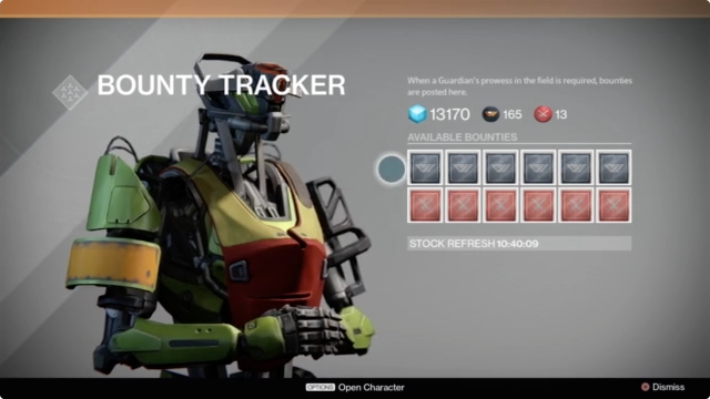
I was quite surprised when I first saw the design of the UI, I expected like most games for the menus to be heavily rendered or very non-intrusive. Instead a lot of the UI is based on flat design, very similar to Metro design (Microsoft's type-based design language). It's a style that's very common in web design nowadays and became popular during the rise of mobile browsing. The reason being that designers became very conscious of performance and the limitations of mobile download and therefore avoided the heavy use of images in a design, and instead using flat colours and live text.
This quickly developed into it's own style, and naturally evolved into a style that leaned on animation to bring it to life. Destiny's UI is an example of this and relies on animation to help explain the behaviour of the UI, and allows motion to provide meaning. For example it uses an animated glimmer on interactive elements to subtly show updated items (unread items), rather than add a badge or unnecessary design elements.
It works surprisingly well with the look of the game, it's clean and let's the beautifully rendered images shine. It's not overcooked with detail, so the UI is very utility friendly. It's modern and relevant to this time.


Congratulations to the team involved (credits at the end of the video). It's really exciting to see such an emphasis being placed on the UI in games (see Dead Space 2 for another example), it is so important and a major part of the game itself.