The Matrix Resurrections
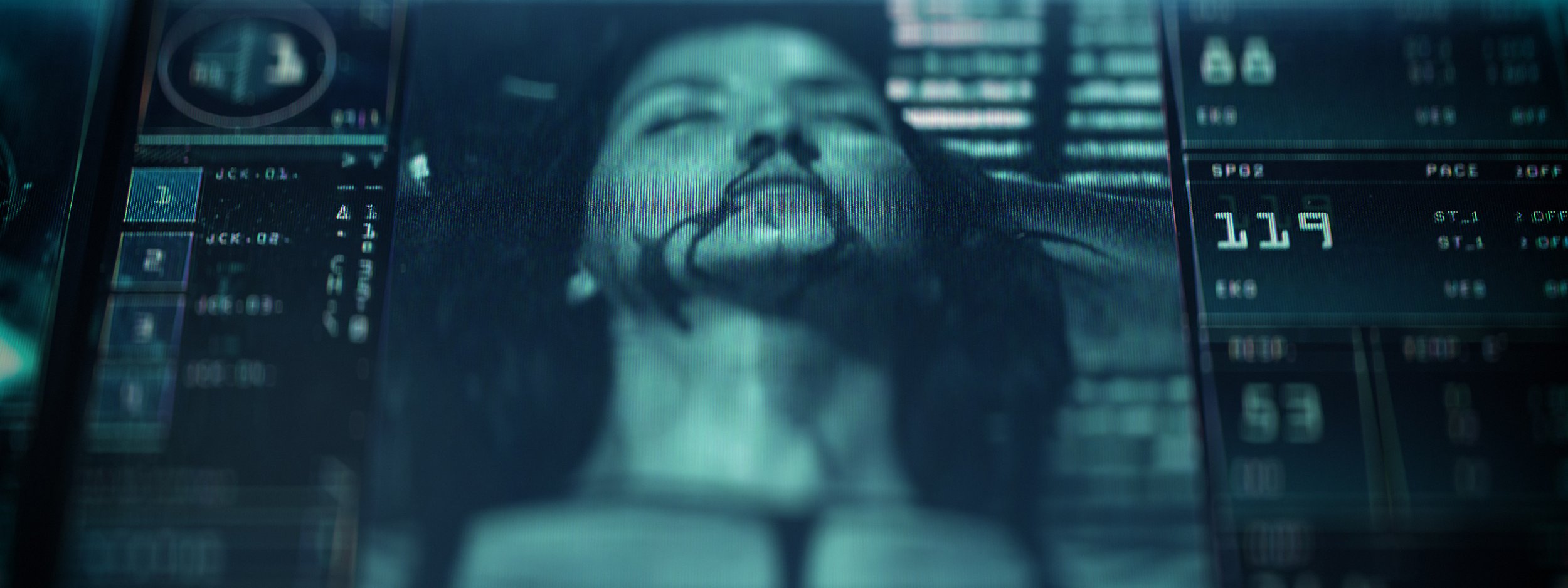
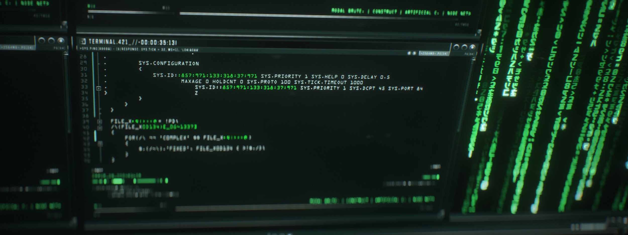
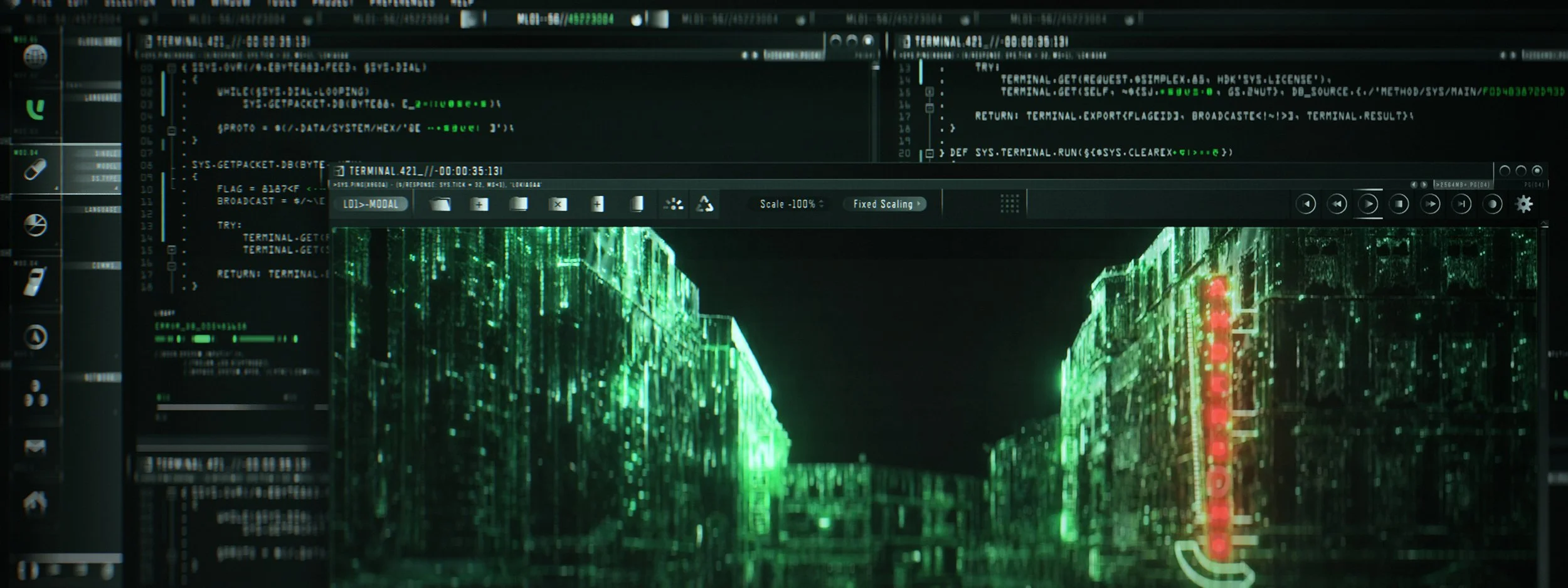
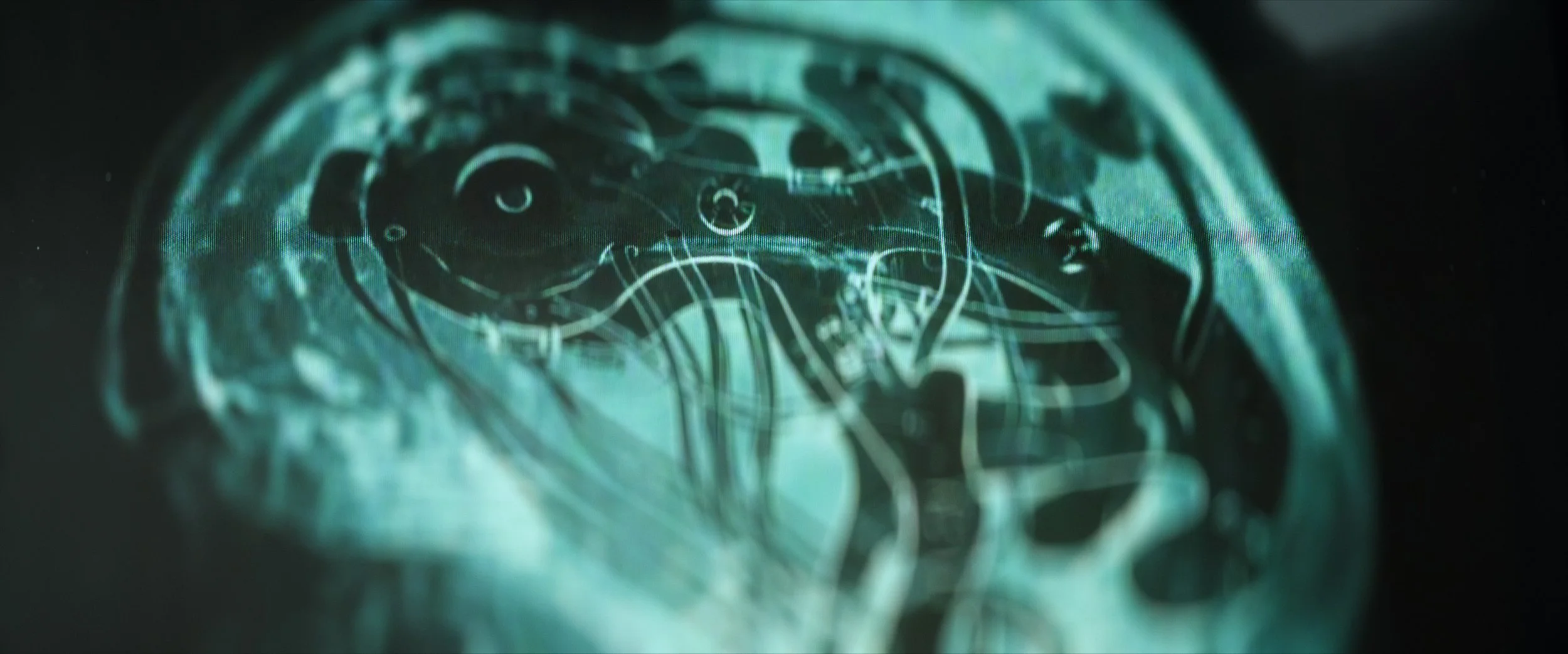
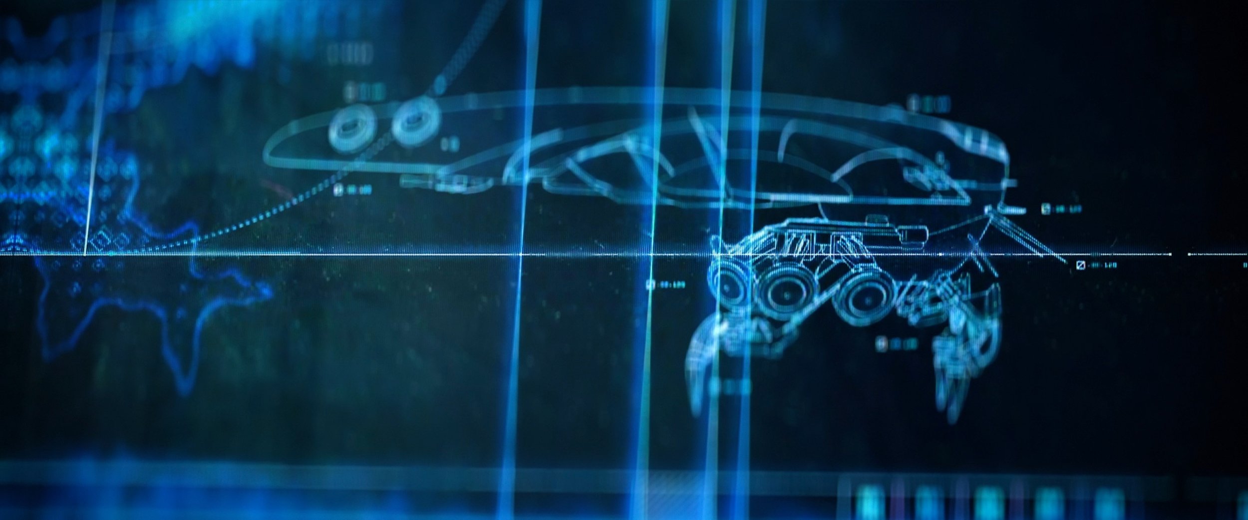
Here’s a look at the UI designs from The Matrix Resurrections created by Studio C, courtesy of Warner Bros Pictures. It’s been ten years since we first posted about The Matrix Reloaded and the designs have come a long way since then. The UI for the latest Matrix film include designs for the main deck of the hovercraft Mnemosyne, screens from within the Matrix, the city of IO and of course the iconic green digital rain.
The film takes place 60 years after the events of The Matrix Revolutions, so although the UI designs pay homage to the previous films, they’ve been allowed to evolve and develop.
The UI from the Mnemosyne is more detailed and complex than in the previous films, though the hardware itself is still quite chunky and tactile, which makes sense in a world of limited resources.
Studio C produced a huge amount of work for this project and you can read more about their process on their site.


